 Metabola
All entries
It's a little late, but Cal Counter is out
Cal Counter went live in September and everything is going better than expected. No technical issues have been hit by users and several people have subscribed. There were no bugs reported, but I found one myself and fixed it.
The bug I fixed was a great example of a corner case. If you delete a saved meal, the meal has its UI changed and says "undo?" letting you undo the delete by tapping. If you navigate away, the meal is deleted. The bug: delete a meal, then use the log+edit feature on a different meal. From that bottom sheet, tap edit and you're navigated away. Navigate back and the deleted meal has reset to its normal state, so you'd have to delete it again. Not exactly a big issue and you would need a user to do three rare actions in a row to get there, but then I hit it, and it would be faster to fix than to write down.
Also if you're wondering, a corner case is where at least two edge cases collide or when several variables are set to extremes, so here doing other actions while one meal was in the soft-delete state is one edge case, then navigating away and returning but from a bottom sheet action is the second edge case.
Now that the app is out and I'm generating revenue, the next step is going to be another rebrand, but the first one post-launch. I'm keeping Cal Counter, but I'm changing the icon and name. It'll no longer include "by Metabola". I'm getting zero traction on Metabola as a keyword and it's confusing Apple's search algorithms. I was getting taps from people looking for commercial gyms, which is the same category, but completely different intent. The other benefit of a rebrand is hopefully the new icon will improve the tap-through rate (TTR). Also this will test the importance of App Store Optimization (ASO) for me. If my TTR or conversion rate (CR) don't change then I would be honestly a little surprised, but it would mean my original brand wasn't bad.
I think I have the new icon picked out. The old M icon was AI-generated. I don't think it looks like slop, but it's not exactly innovative. I did get an icon designed on Fiverr for $5 and I wasn't sure what I was expecting. I learned to lean on AI here and I'll circle back when I can afford to hire out graphic design. For now the latest models are better at graphic design than when I did the first icon, so I'm able to easily iterate. Fiverr's stock price is down more than 60% in the last year, so maybe a lot of people have this mindset?
Here are the icons though for you to make your own judgement.
| The current icon | The Fiverr design | The new icon |
|---|---|---|
 |
 |
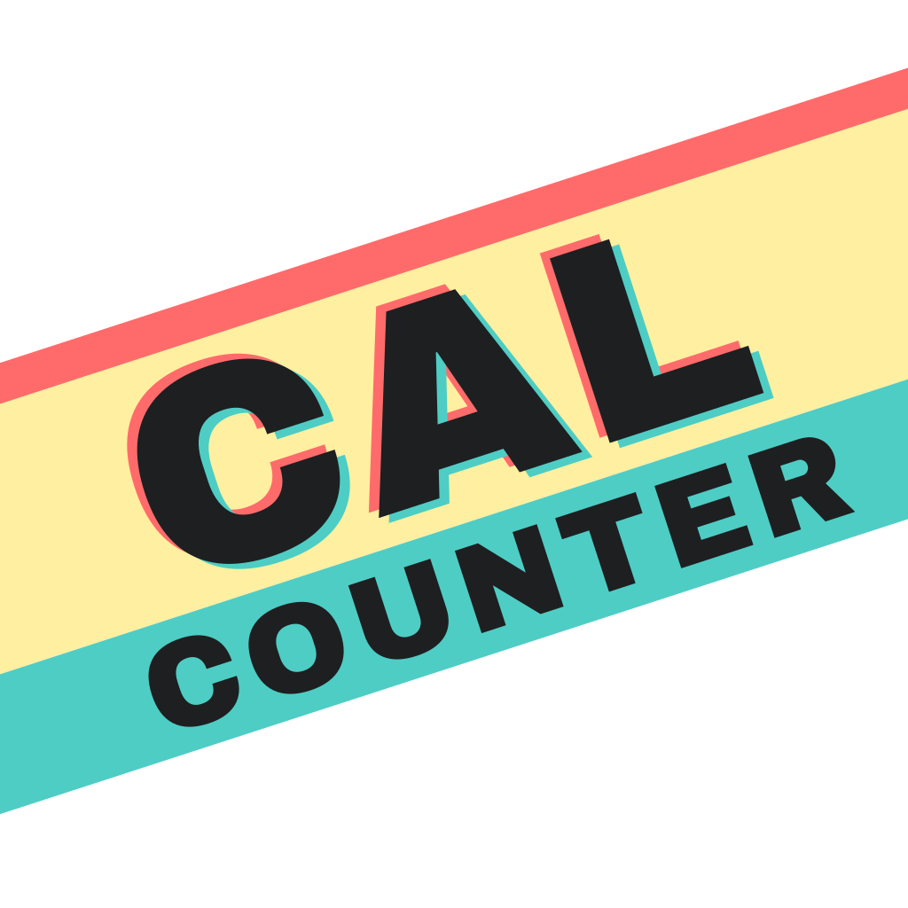 |
The new icon and name should ship next week assuming I collect enough data by then.